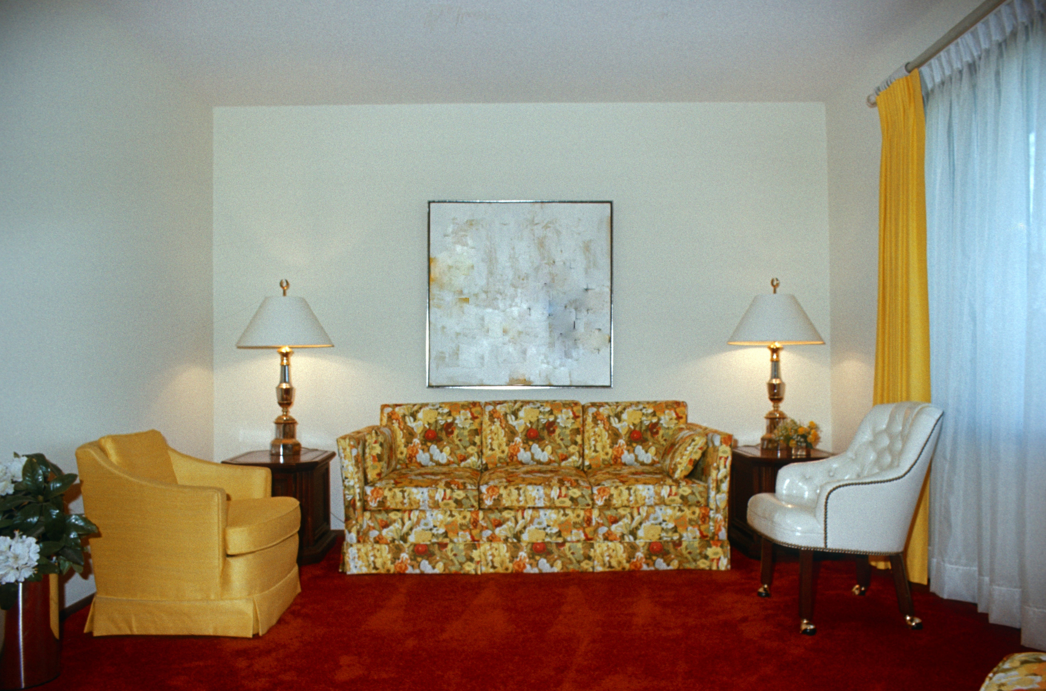
Shag carpets, crocheted owls hung on the walls, floral prints and orange: if you grew up in the 1970s, chances are your house was decorated with at least one of these (or most likely all) home décor trends and at the time, they looked great. Looking back on those trends now produces feelings ranging from, “Whatever happened to those ceramic mushrooms?” to “I’d rather die than have anything orange in my house.”
No, this article isn’t about a recent resurgence of trends that shouldn’t ever be popular again, but the nauseating visual I’ve (hopefully) created for you leads us into the topic at hand: modernizing and updating the look and feel of your InReach powered CE catalog. Now there’s no way your catalog is as bad as the average suburban home in the 1970s, but if you’re not keeping an eye on what’s considered modern, you could very well find yourself lagging behind the competition.
So what is considered modern in terms of website design and how can we help? Here are just a few things we can do to your catalog to give you the competitive edge:
Flattening
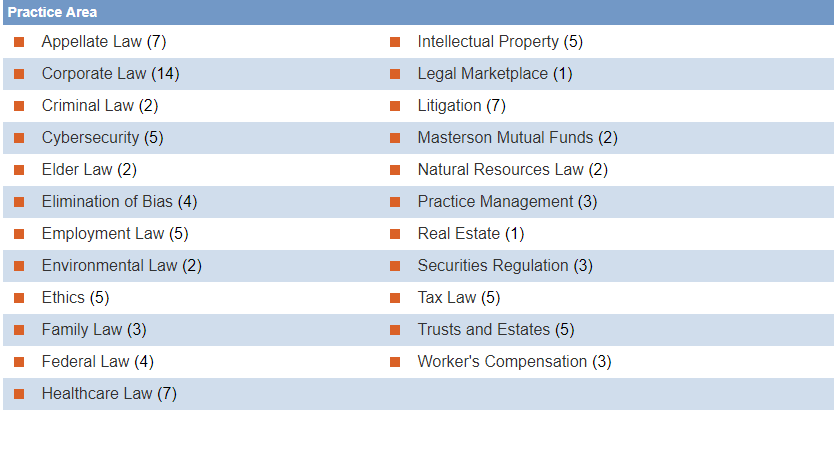
Gone are the days of drop shadows and gradients, these days it’s all about flat, flat, flat. We’re talking about bold colors and fonts, borderless, self-contained elements and a clean appearance. Having trouble picturing it? Check out the before and after:
Before: After:
Before:
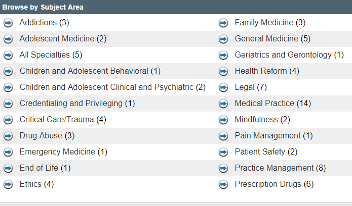
After:
Contact Us Pop Up
We pride ourselves in delivering world class support to your learners when they have an issue or a question. We’ve now made it easier to access that world class support with a collapsible pop up that follows learners throughout the shopping experience.
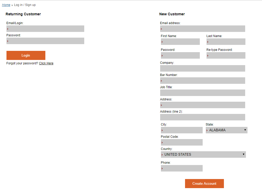
Enhanced Log-in Page
Tired of the same old log in page? We can give it a facelift!
Before:
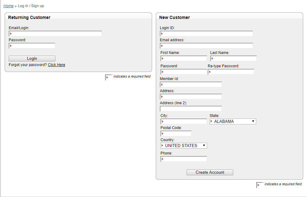
After:
Like what you see? Ready to rip out the avocado green shag carpet? Contact your CSM today to explore all of the available options in modernizing your catalog.







Adele Baseman
I visit everyday a few web pages and blogs to read articles or reviews, except this webpage gives quality based content.