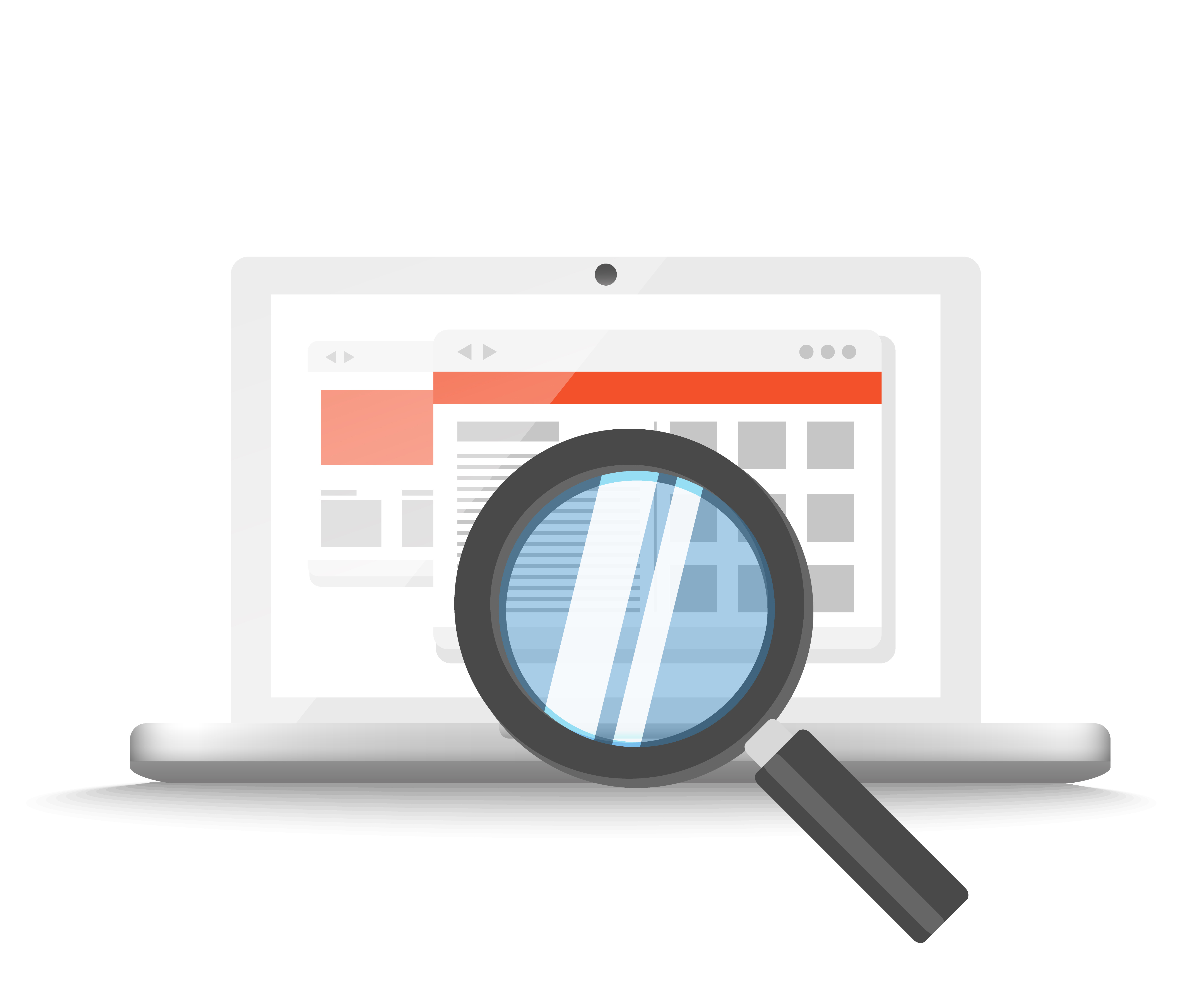
They say it’s the small things in life that count and this is certainly true for the online education world. Something as simple as number of clicks from here-to-there can win or lose a customer. However, thanks to website analytics, tracking when potential participants leave a website due to frustrating navigation can be determined.
You can find all sorts of research on website navigation, but simple logic goes a long way toward helping continuing education seekers find your courses.
The first rule: don’t make them work too hard.
Or better said: make it easy for them to find the things you want them to find and make what they find fit your needs. Online education is a significant revenue generator for many professional organizations, which makes it all the more important for the catalog to be visible from your main entry pages. If your potential customer has to maneuver through several pages, ones they may not really care about, to get to your catalog, or forbid, gets stuck on a page, you could easily lose their business.
Here are a few simple tips that we provide our customers when their goal is to convert more website visitors to continuing education participants:
- Put CE in the main navigation bar on your website. When visitors click, make sure the link brings them to one place where they can browse/shop for continuing education content
- Add a banner ad or clearly marked button to your homepage – something colorful and catchy (with minimal type/a simple message) that links directly to your catalog
- Make sure the message in your banners and your link names are clear and direct (clever can = lost when it comes to navigation)
- Review your website to find other pages where a link to educational content makes sense and add those links everywhere that might be helpful to your visitor
- Within the catalog: make sure visitors can easily find what they’re looking for – ability to browse by topic area, good search function, featured courses up front, and make mandatory courses easy to locate
When it comes to your website, first impressions are very important. You may only have one shot to win over a prospective participant. Your members may be a little more forgiving, but it won’t be positively received. You should also never want them to have a Where’s Waldo experience going through your website.
Scouring a page trying to find the bespectacled person in the striped shirt might be fun for the kids, but scouring your website to find continuing education courses is no fun for the adults, nor a good strategy for professional education websites.
Stay tuned for next week’s post about how to help your members find content once they are actually in the catalog!